Outline: For this exercise you will be adding one element from a different image. The aim is to take a conventional landscape view and and render the sky so that is appears ideally exposed.
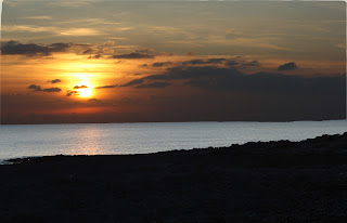
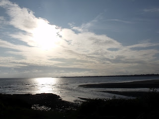
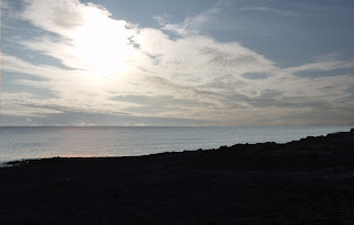
I have recently been out shooting sunsets at the seaside. With my camera on auto settings, I took the first image which of course was perfect for the foreground but it left the sky looking a little flat and completely underwhelming compared to the dramatic sky infront of me. So I decreased the exposure and altered the white balance to cloudy to try and better the image. These are the two images that were produced at the time:
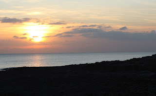 |
| lighter foreground image |
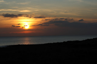 |
| darker for sky image |
|
|
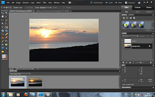
First step was to combine the two images, lighter on top of the darker image. As I use photoshop elements, I was able to layer the lighter image on top of the darker image with no problems.
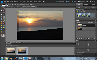 |
| Layering one image on top of the other |
After I had successfully combined the images (the lighter was slightly smaller than the darker so it took a bit of time, my own fault for not using a tripod!) , I then used the eraser tool to 'erase' the sky from the top 'lighter' image to reveal the darker sky beneath.
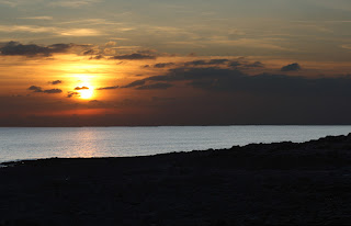 |
| erased sky from light top image - flattened |
As you can see, the horizon isn't perfectly straight from using the eraser tool but it's done the job. We have the lighter foreground with that fabulous dramatic sky.
For the second part of this exercise, I had to complete exactly the same effect but using a selection tool instead of using the eraser tool. That way I could select the sky using the rectangle tool, perk of having a nice flat horizon, and then just delete the selection from the top layer.
 |
| selecting the sky with the rectangle tool |
This then again gave the same outcome but with a straighter horizon line for me in this image. I can image though, how using the selection tool would be better to control the parts to be erased, as I find when using the eraser I tend to have to continuously alter the brush size etc to get all the bits deleted. Here is the final outcome using the selector tool:
 |
| sky deleted using selector tool - flattened |
Yes, I can see that this again does not have a perfectly straight horizon but the actual horizon on the images was at a slight angle and had I deleted a straight line, there would've been some unwanted detail of the sky on that side of the image.
I decided to download the free trial of Photomatix to see what the adjustment would look like using an exposure-blending program, just to compare with the two attempts that I did. I made sure that I used the exposure blending procedure and the highlights & shadows - Adjust option and here is the outcome:
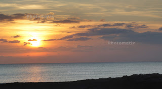 |
| Photomatix blend outcome |
It's tidier than my attempt but the sky isn't as fierce as it could be or as it was on the day. But the neatness and overall merge is very impressive.
So now to use a 'sky' from another image. I took a very fierce sky image one morning years ago, by hanging out my back window as I had never seen the sky like that. This is the photograph that I took that day :
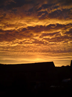 |
| alternative sky 1 |
I know this probably wouldn't work on a beach scene but thought I'd give it a go anyway. With a basic select and copy to the beach image, I got this image:
This looks weird but a successful attempt at altering the sky. I toned down the brightness off the selection twice to see if that made it look any more realistic:
I think this version is a lot better and out of the three versions (including the next one), I think this one works best. Reducing the brightness and contrast again brought me to this image:
I think this one is just as unsuccessful reality-wise as the first basic attempt.
But in a bid to try and keep the exercise as realistic as possible, I did it again with another beach sunset, but without the colour aspect.
 |
| alternative sky 2 |
This is a similar set up to the original sunset image I was working on with the sun in pretty much the same place. I had to be careful with the horizon of this image as it's not just water as there is land in the distance, but the outcome came out pretty well:
 |
| Final image |
Conclusion:
And there it is, a sky taken from one image and transferred to another image. And I must say I m happy with it. But this is where I'd say we were misleading the viewer as this 'subject' never actually existed. The first part of the exercise, altering the sky to make it appear ideally composed is fine, as we are only enhancing what is already there. But to change one factor of an image for something different is falsifying the image.


